Choosing the Right Headshot Style for Your Industry (With an AI Style Picker + Examples)
Choose the right headshot style for your industry with an outfit/background/crop matrix, role-based modifiers, and a PhotoGuru AI workflow—plus a selfie upload checklist and anti-AI-looking realism fixes.

Choose a headshot style that matches your industry’s formality and the role you want next: conservative outfit + clean background for finance/law, modern business-casual for tech, and more expressive wardrobe and lighting for creative fields. Keep it consistent (neutral colors, simple backdrop, confident expression) so it looks credible on LinkedIn and your website.
Quick 60-second style picker (before you overthink it)
If you want a headshot that “fits” immediately, make these decisions in order. You can do this whether you’re hiring a photographer or generating options from selfies.
- Pick your baseline industry norm (finance/law = conservative; tech = modern business-casual; creative = controlled personality).
- Decide your context (job seeker, team page, founder brand, speaker page).
- Choose one “safe” background (plain neutral or clean office blur).
- Choose wardrobe formality (one notch above your day-to-day if you’re client-facing or leveling up).
- Pick crop + expression (tight + composed for authority; slightly wider + warmer for approachability).
The 5 style levers that matter (and why recruiters/clients notice them)
Most headshot advice is vague (“look professional”). A better approach is to make five explicit choices that signal how you work and who you work with. People may not consciously name these cues, but they feel the difference between “credible peer” and “something feels off.”
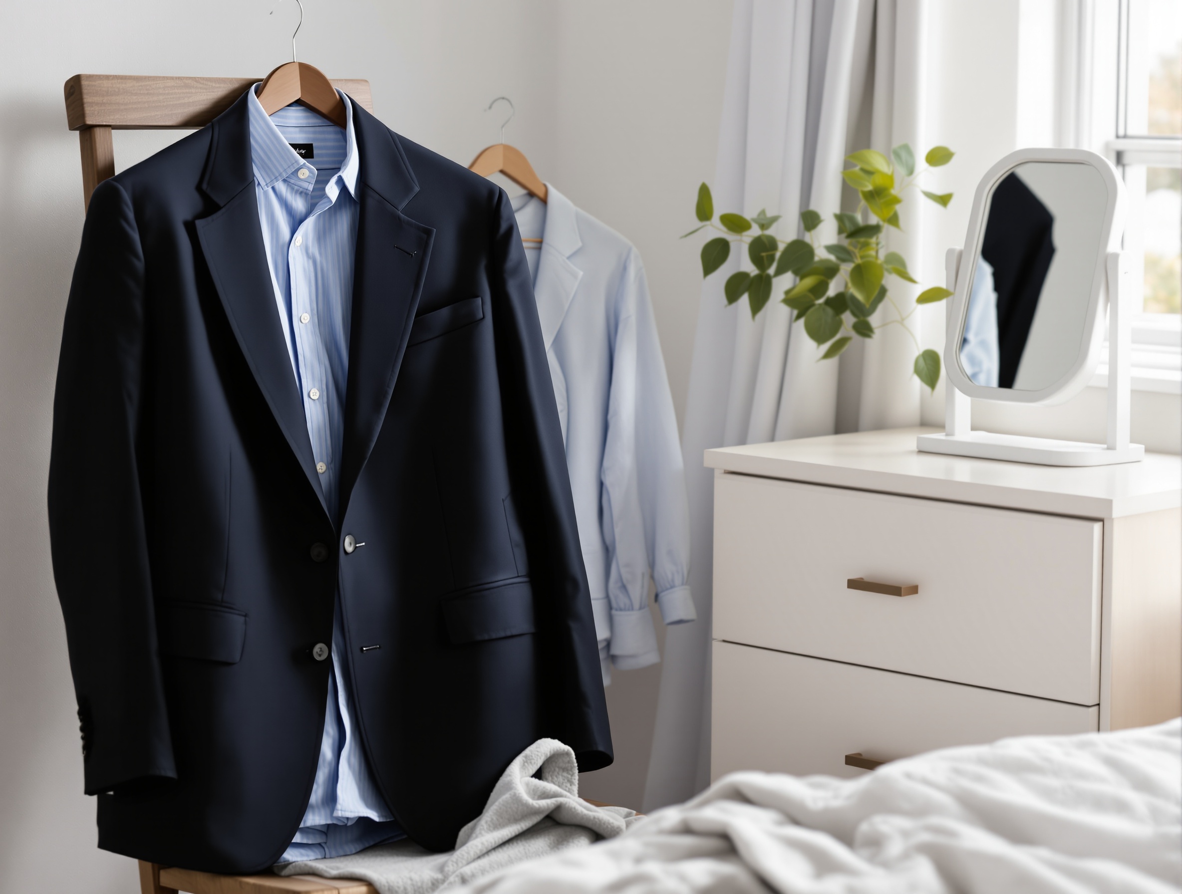
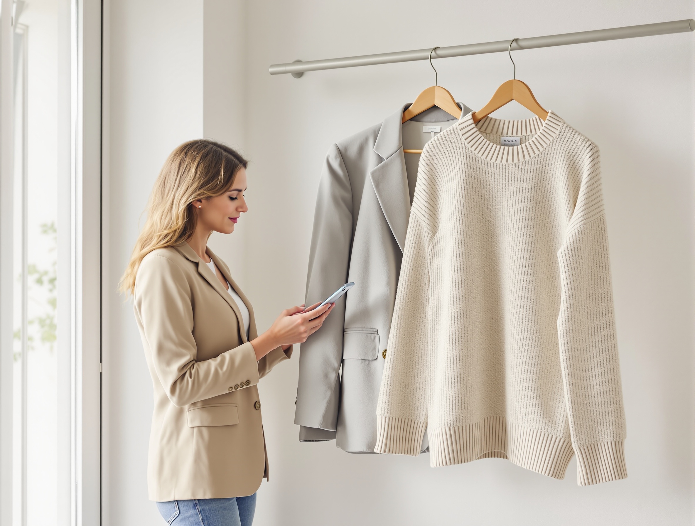
1) Outfit formality (signals authority and risk tolerance)
Outfit formality is the fastest “industry cue.” A suit jacket or structured blazer implies a high-trust, high-stakes environment. A crisp knit or blazer-with-T-shirt can read modern and product-oriented. Strong color or texture can read creative—if the rest of the image stays clean and intentional.
- If you’re job-seeking into a more conservative industry, dress for the role you want, not the role you have.
- Avoid busy micro-patterns (tight stripes, tiny checks) that become distracting in small profile crops.
- Prioritize fit at shoulders and collar; sloppy fit reads “rushed,” even with a great expression.
What to wear for a professional headshot by industry (quick starts)
| Field | Usually reads best | Avoid if you want to look conventional |
|---|---|---|
| Finance / accounting | Blazer or suit; light shirt/top; minimal accessories | Very casual tops, loud prints, edgy styling |
| Law / compliance / government | Structured jacket; conservative colors; clean collar lines | Trendy streetwear silhouettes, statement jewelry |
| Tech / product / SaaS | Polished business-casual; optional blazer; tidy basics | Wrinkled tees, overly casual hoodies (unless clearly on-brand) |
| Sales / real estate / recruiting | Crisp layers; slightly more polished than client norm | Aloof, severe styling that fights “approachable” |
| Creative roles | Elevated casual; one intentional color/texture choice | Heavy patterns, too many “statement” elements competing |
2) Background (controls perceived professionalism and focus)
Background isn’t just aesthetics—it’s risk management. A clean, neutral background reduces distractions and lowers the chance something looks messy, dated, or off-brand. Contextual backgrounds (office, studio, outdoors) can work in roles where personality cues matter, but they must stay simple and intentional.
Best headshot background for LinkedIn (practical picks)
- Safest: plain light gray/off-white (studio look).
- Also works: softly blurred office with no identifiable clutter.
- If you want “modern”: a slightly darker neutral background with clean contrast (not a detailed scene).
- Skip: busy bookshelves, bright windows, neon signage, or backgrounds that look like a template.
3) Lighting & contrast (clean and honest vs dramatic and editorial)
Lighting decides whether your headshot feels like a corporate directory photo, a modern startup profile, or a creative portrait. Even, soft lighting is the safest for most industries because it looks clear and “truthful.” More contrast and shadow can add character, but it raises the risk of looking moody or overly stylized in conservative fields.
- Finance/law: aim for bright, even lighting with minimal shadows across the eyes.
- Tech/product: slightly more contrast is fine, but keep skin tones natural and avoid heavy color grading.
- Creative: you can use more shape (side light), but your eyes still need to read clearly in a thumbnail.
4) Crop & framing (how close you feel)
Crop is a credibility cue. Tight head-and-shoulders crops look direct and executive (common in corporate directories). Slightly wider crops can look more relaxed and modern, and may be better for founders and creatives—if your face is still the hero. If you’re unsure, start with head-and-shoulders because it adapts best across platforms.
5) Expression & posture (approachable vs authoritative)
Expression is where “professional” becomes personal. A gentle smile reads collaborative; a calm neutral expression reads discreet and authoritative. Neither is universally correct—your industry, role, and audience decide. If strangers must trust you quickly (sales, recruiting, healthcare), go warmer. If your work emphasizes judgment and discretion (law, compliance), choose calm confidence over high enthusiasm.
Headshot style by industry: a fast style picker (with examples)
Use the matrix below as your default starting point. Then adjust for seniority and whether you’re client-facing (next section). The goal isn’t a rigid rulebook—it’s avoiding unnecessary friction like “Do they fit our culture?” or “Are they as senior as they say?”
| Industry / field | Outfit default | Background default | Vibe | Crop |
|---|---|---|---|---|
| Finance, banking, accounting | Suit or structured blazer; conservative color | Plain neutral or clean office blur | Steady, discreet, high-trust | Tight head-and-shoulders |
| Law, government, compliance | Blazer/jacket; minimal accessories | Neutral studio look; no distractions | Authoritative, precise | Tight head-and-shoulders |
| Tech (engineering, product, SaaS) | Polished business-casual; optional blazer | Light neutral or modern office blur | Competent, modern, friendly | Head-and-shoulders (slightly wider OK) |
| Sales, real estate, customer-facing roles | Dress slightly above client norm; crisp layers | Clean office blur; subtle context OK | Warm, energetic, approachable | Head-and-shoulders; avoid too tight |
| Healthcare & wellness | Clean professional attire; simple grooming | Neutral, bright, calm | Reassuring, attentive | Head-and-shoulders |
| Consulting, agencies, B2B services | Smart business; tailored look | Neutral or tidy office blur | Confident, competent | Tight to medium |
| Creatives (design, media, creators) | Elevated casual; controlled color/texture | Textured neutral or contextual, uncluttered | Distinct, personable | Medium crop; face still prominent |
| Founders & entrepreneurs (personal brand) | Depends on audience: investor vs community | Neutral or brand-consistent context | Credible + personal | Medium crop; adaptable |
Finance, banking, accounting
In finance, headshots are often evaluated for stability. Choose conservative styling: solid colors, minimal contrast in patterns, and clean grooming. A studio-neutral or subtle office-blur background helps you look like a safe pair of hands. Expression: a small, controlled smile is usually safer than a big grin.
- Best bet: dark blazer + light shirt/top, neutral background, tight crop.
- Avoid: overly trendy styling, dramatic shadows, highly saturated backgrounds.
- If you’re client-facing: choose the warmest expression that still feels formal.
Law, government, compliance
These fields often reward clarity and authority. Keep the look straightforward: neutral backdrop, even lighting, structured outfit, and an upright posture. If you’re using the headshot for a firm bio, avoid anything that reads like a casual selfie—even if it’s sharp—because genre expectations are strict.
- Best bet: neutral studio look, minimal accessories, tight crop.
- Avoid: trendy lighting, busy environmental backgrounds, overly playful expressions.
- If you’re applying to a more formal firm: match the most conservative norm you see on their team page.
Tech (engineering, product, SaaS)
Tech headshots sit between corporate and casual. Polished business-casual often reads “current” and credible: clean collar lines, minimal accessories, and a modern neutral background. If your goal is leadership (manager/director), add structure (blazer) and tighten the crop slightly so you read more authoritative without going fully corporate.
- Best bet: neutral background, natural skin tones, gentle smile, head-and-shoulders framing.
- Avoid: “passport photo” stiffness or overly dramatic editorial lighting.
- If you’re interviewing at a more traditional company: generate one more conservative variant for safety.
Sales, real estate, and customer-facing roles
Here, your headshot is a trust-and-approachability asset. Prioritize a warmer expression and a slightly less severe crop (still professional). A softly blurred office background can help—as long as it stays uncluttered. Wardrobe should be one step above the average client meeting so you read polished without looking stiff.
- Best bet: bright, flattering lighting and a friendly expression.
- Avoid: moody lighting or a distant crop that makes you feel unapproachable.
- If you work locally (real estate): a subtle “real place” vibe can help, but keep it clean.
Healthcare and wellness
Patients and clients scan for calm competence. Choose bright, even lighting and a clean background. Expression should be reassuring (gentle smile or soft neutral). Wardrobe should look clean and professional; avoid flashy accessories that distract. If you have a clinician vs coach split, clinicians typically skew more conservative, while coaches can go slightly more personal—still tidy.
- Best bet: clean neutral background and very clear eyes (no harsh shadow).
- Avoid: overly stylized looks that feel like lifestyle influencer imagery (unless that is your brand).
- If you’re building trust with anxious clients: choose the warmest credible expression.
Consulting, agencies, and B2B services
Your headshot should imply: “I can talk to executives and work with your team.” That usually means smart business styling with a modern edge: tailored layers, neutral background, clear lighting. A medium crop can work well on agency websites where your headshot appears next to a short bio.
Creatives (design, media, creators)
Creative industries give you more range, but they still punish “messy.” The trick is controlled personality: a slightly more expressive outfit (color or texture), a background with subtle texture or context, and lighting that adds shape without hiding your eyes. If you’re applying to more corporate creative teams (in-house brand/design), keep it cleaner and closer to tech norms.
- Best bet: medium crop, textured neutral background, outfit with one interesting element (not five).
- Avoid: extreme angles, heavy filters, harsh color casts that change skin tone.
- If you’re client-facing: keep the expression warm and the styling intentional rather than edgy.
Founders & entrepreneurs (personal brand)
Founders need a style that travels: LinkedIn, website, press, podcasts, and investor updates. The key decision is audience. If you’re fundraising or selling enterprise, skew more corporate (structured outfit, clean background). If you’re building a community-driven brand, you can be more personal (slightly wider crop, softer context) while staying polished. Many founders do best with two headshots: one “boardroom” and one “brand.”
- Create a “safe” investor-friendly version (neutral background, structured wardrobe).
- Create a “brand” version (slightly wider crop, subtle context) for your website and creator surfaces.
- Keep both clearly recognizable as you; credibility is part of personal branding.
Role-based modifiers: IC vs manager vs executive (and client-facing vs internal)
Industry norms set the baseline, but roles change the dial. Two people in the same company can need different headshot styles: an internal IC can look more relaxed; a client-facing leader often benefits from more structure and a tighter crop. Use this as an adjustment layer on top of the industry matrix.
| Role / context | What to emphasize | What to avoid | Practical tweak |
|---|---|---|---|
| Individual contributor (internal) | Approachable competence | Overly severe “executive” stiffness | Slightly wider crop; softer smile |
| Manager / team lead | Clarity + authority | Trendy styling that dates quickly | Add a blazer or structured layer |
| Executive / partner | Presence, discretion, consistency | Casual wardrobe or busy backgrounds | Tighter crop; neutral background |
| Client-facing (any seniority) | Warmth and trust | Aloof expression | Gentle smile; brighter lighting |
| Job seeker / career switcher | Fit for the next role | Dressing for the old industry | Match target industry’s default formality |
| Founder / public-facing personal brand | Credibility + personality | Looking like a stock photo | Create two variants: “corporate” and “brand” |
Corporate vs creative headshots: how to pick without overthinking
The corporate vs creative question is really about how much uncertainty your audience tolerates. Corporate headshots reduce uncertainty: consistent, formal, and “standard.” Creative headshots introduce controlled individuality: taste, personality, point of view. Neither is better—misalignment is the problem.
| Dimension | Corporate headshot | Creative headshot | Good for |
|---|---|---|---|
| Wardrobe | Structured, neutral, minimal | Elevated casual; color/texture allowed | Corporate: finance/law/execs; Creative: design/media/creators |
| Background | Plain or subtle office blur | Textured neutral or contextual | Corporate: firm sites, investor decks; Creative: portfolios, creator bios |
| Lighting | Even, soft, minimal shadow | More shape/contrast (still clear) | Corporate: trust-first roles; Creative: brand/story roles |
| Crop | Tighter head-and-shoulders | Medium crop with a bit more environment | Corporate: directories; Creative: websites, press kits |
| Expression | Calm, composed | More personality (still professional) | Corporate: authority; Creative: approachability + identity |
Platform adjustments: LinkedIn vs company website vs speaker page
Even the “perfect” headshot can underperform if it’s framed wrong for the platform. LinkedIn often displays your photo very small, next to dozens of other faces, so clarity and contrast matter. Company team pages emphasize consistency across people. Speaker pages and press kits may display larger images, where skin tone, hair edges, and retouching become more noticeable.
LinkedIn: prioritize the thumbnail test
LinkedIn rewards headshots that are readable at tiny sizes: clear eyes, simple background, and a face that fills the frame. If LinkedIn is your primary surface, see LinkedIn profile picture tips that get noticed for a deeper walkthrough of framing choices and how to evaluate your image at thumbnail size.
- Crop closer than you think (head-and-shoulders usually wins).
- Choose a background that stays clean inside a circle crop (no clutter near your head).
- Avoid harsh shadows across the eyes; keep both eyes clearly visible.
Company website/team page: consistency beats individuality
On team pages, your headshot is judged alongside others. If one person has dramatic creative lighting and another has flat directory lighting, the page feels inconsistent. If you’re making headshots for a team, pick one background tone, one crop tightness, and one lighting style—then keep everyone inside those rails.
Speaker pages/press kits: realism matters more at large sizes
When images display larger, overly smooth skin, strange hair edges, or unnatural teeth stand out. If you’re choosing between “more glamorous” and “more believable,” pick believable—especially if your headshot will be reused by event organizers or media.
| Platform | What works best | Common failure mode | Quick fix |
|---|---|---|---|
| Tight head-and-shoulders, clear eyes, simple background, good contrast | Face too small; busy background; harsh shadows | Crop closer; choose neutral background; brighten the eye area | |
| Company team page | Consistent style across team (background + crop + lighting) | One headshot looks “different” and breaks the page | Pick one direction for everyone; match crop and background tone |
| Founder website / about page | Slightly wider crop can feel more human; still clean | Overly casual or too stylized for credibility | Keep wardrobe elevated; simplify background |
| Speaker page / press kit | Natural skin tone and clean edges matter at larger sizes | AI artifacts or over-smoothing become obvious | Choose the most natural option; check hair, glasses, and teeth closely |
| Email / Slack avatar | Very simple background; strong face-to-background separation | Details disappear; outfit becomes irrelevant | Prioritize expression and contrast over wardrobe detail |
Turning everyday selfies into the right professional style with PhotoGuru AI
Most “headshot style by industry” guides stop before the last mile: how to actually get that look quickly. PhotoGuru AI is built for a selfie-to-professional workflow: upload everyday photos, choose style directions, and generate headshots you can use on LinkedIn, team pages, and bios. The key is translating the levers you picked earlier into a small set of consistent style targets—not a random mix of looks.
| Your target outcome | Select styles that look like | Avoid styles that look like |
|---|---|---|
| Conservative corporate (finance/law/compliance) | Neutral studio, clean office blur, even lighting, structured wardrobe | High-fashion editorial lighting, dramatic shadows, highly saturated scenes |
| Modern professional (tech/B2B/consulting) | Modern neutral background, polished business-casual wardrobe, natural contrast | Overly smoothed “glam” retouching, extreme color grading |
| Warm and approachable (sales/healthcare) | Bright, flattering lighting, friendly expression, simple background | Aloof expressions, dark moody setups, distracting environments |
| Creative but credible (design/media/creators) | Subtle texture or context, controlled color, medium crop with clear face | Gimmicky props, extreme angles, “cinematic” looks that hide the eyes |
Pick 2–3 styles (don’t bet everything on one look)
A practical way to use PhotoGuru AI is to generate a small “set” that covers your real use cases. For example, if you’re in tech but applying to more enterprise-facing roles, generate: (1) a modern business-casual option, (2) a more corporate option, and (3) a plain neutral “safe” option. This reduces the chance you end up with one headshot that’s great on your website but underperforms on LinkedIn.
- Finance/law set: neutral studio + clean office blur + slightly warmer expression variant.
- Tech set: polished business-casual + blazer/leadership variant + plain neutral background.
- Creative set: textured neutral + contextual but uncluttered + simple neutral for LinkedIn.
Use a “consistency set” for teams and brand pages
If you’re generating headshots for a team page, consistency is the professionalism multiplier. Pick one shared direction (background tone, crop tightness, lighting) and have everyone generate within it. A team page looks “off” when one person has a dramatic creative portrait and another has a flat passport-style crop—even if both are individually fine.
Quick realism checks before you download
To avoid an AI headshot looking fake, evaluate it the way a skeptical recruiter would: zoom in, then zoom out. Zoomed out, does it look like a normal professional headshot in your industry? Zoomed in, do the details look natural and consistent with your real appearance?
If you want a LinkedIn-first way to score realism and performance, PhotoGuru AI: Your Guide to LinkedIn Profile Pictures That Get Noticed walks through what to check when your photo appears as a small circle next to dozens of similar profiles.
Selfie upload checklist (to get better AI headshots)
Your uploads determine whether your results look realistic and consistent. The goal isn’t “perfect selfies”—it’s a set of photos that clearly show your face in varied but natural conditions. Think of it as giving PhotoGuru AI enough truthful information to generate professional variations of you.
How many selfies to upload (and what counts as a “good” upload)
For most people, a set of roughly 10–20 clear images is a strong starting point because it balances variety with consistency. The best selfie uploads for AI headshots are sharp, well-lit, and recent—without heavy filters or face-tuning. If results look inconsistent, the fix is usually more consistent photos, not more random variety.
- Lighting: include several photos in soft daylight (near a window) and a few in indoor light; avoid extreme shadows across your face.
- Angles: include straight-on and slight three-quarter views; avoid extreme high/low angles that change proportions.
- Distance: include close head-and-shoulders and a few slightly wider (upper torso) shots.
- Expression: include neutral and gentle-smile photos so you can generate both corporate and warmer options.
- Grooming consistency: keep hair, facial hair, and makeup broadly similar across most uploads for consistent outputs.
- Image quality: choose sharp photos without heavy beauty filters, face-tuning, or aggressive portrait blur.
- Skip: sunglasses, hats, group photos, and images where your face is partially covered.
If your goal is a LinkedIn-ready result, LinkedIn profile picture PhotoGuru AI explains how to sanity-check your image the same way LinkedIn viewers will: fast, small, and side-by-side with other profiles.
Common mistakes that make headshots look unprofessional or AI-generated (and how to fix them)
Many “bad headshots” fail for predictable reasons. Some are classic photography problems (bad crop, messy background). Others are AI-specific (identity drift, over-smoothing). Use the fixes below to get results that hold up on LinkedIn, company bios, and speaker pages.
Mistake 1: Your face is too small (or the crop is inconsistent)
If your face is a small part of the frame, you lose the trust benefit of a headshot—especially on LinkedIn. Fix it by choosing a head-and-shoulders composition where your eyes are clearly visible and centered. For multiple platforms, keep a tighter “profile version” and a slightly wider “website version.”
Mistake 2: The background competes with your face
Busy shelves, sharp lines, and bright windows pull attention away from your expression. Fix it by switching to a neutral studio-style background or a clean blur. For trust-first industries, “boring on purpose” is a feature, not a flaw.
Mistake 3: Overly trendy wardrobe (or distracting patterns)
Trends date quickly, and patterns create noise in small crops. Fix it by choosing solid, neutral-to-mid tones and classic shapes. If you want color (common in creative fields), keep it to one controlled element so your face remains the focal point.
Mistake 4: Your expression doesn’t match the job
A very serious expression can read unapproachable in sales or healthcare; a big grin can read too casual in law or compliance. Fix it by generating at least two expression variants: one warm and one composed. Then choose based on where the headshot will live (LinkedIn vs firm bio vs speaker page).
Mistake 5: AI “tells” (over-smoothing, odd edges, strange teeth/eyes)
Common AI tells are subtle: skin that looks like plastic, hair edges that melt into the background, glasses that warp, or teeth that look unnaturally uniform. Fix it by selecting the most natural-looking option, favoring even lighting, and using sharp, unfiltered uploads. If an image is almost perfect except for one obvious artifact, it’s usually safer to choose a different result that’s slightly less “glamorous” but more believable.
Mistake 6: Your upload set is too inconsistent (identity drift)
If half your selfies have different hair, different facial hair, heavy makeup changes, or heavy filters, your results can vary too much to be useful. Fix it by re-uploading a tighter set where most images share the same grooming baseline. Use “variety” for angles and lighting—not for completely different versions of you.
Mistake 7: The headshot doesn’t look like you (credibility problem)
Even if an AI image looks “professional,” it can backfire if it changes your recognizable features or makes you look like a different person. Fix it by choosing outputs that match your current appearance and by treating AI as a faster path to a normal headshot—not as a tool to redesign your identity. If your industry is highly regulated or conservative, lean toward the most realistic, straightforward option.
FAQ: choosing headshot styles by industry + AI headshot questions
How do I choose the right headshot style for my industry?
Match your headshot to (1) how formal your industry is and (2) the role you want next. Choose a baseline using five levers: outfit formality, background simplicity, lighting (clean vs dramatic), crop (tight vs medium), and expression (warm vs composed). When unsure, go one notch more conservative, then generate a second “modern” option to A/B test.
What’s the difference between a corporate and creative headshot?
Corporate headshots prioritize trust and consistency: structured wardrobe, simple background, even lighting, and a straightforward head-and-shoulders crop. Creative headshots prioritize personality: more expressive styling, subtle texture or context in the background, and lighting with a bit more shape—while still keeping your face clear and professional.
What should I wear for a professional headshot by industry?
Wear what your audience expects you to look like on your best day at work. Finance/law/government usually reads best with a blazer or suit in neutral colors. Tech and B2B roles often work with polished business-casual (clean collar lines, optional blazer). Creative roles can use stronger color or texture, but keep patterns subtle and the fit clean—your face should stay the focus.
What background works best for a professional headshot (especially LinkedIn)?
A simple, uncluttered background wins most of the time—light gray, off-white, or a gently blurred office. For LinkedIn (small circular crops), prioritize face-to-background separation, avoid bright windows or clutter behind your head, and use lighting that keeps both eyes clearly visible.
Is it okay to use an AI-generated headshot for work or LinkedIn, and how do I keep it looking natural?
Often, yes—if it’s truthful to how you look and fits your workplace norms. Keep it natural by choosing a conservative style, avoiding extreme retouching, and selecting outputs that match your current hair, facial hair, and overall look. Before using it publicly, zoom in for artifacts (eyes/teeth/glasses edges) and zoom out to confirm it reads like a normal headshot in your industry.
How many selfies should I upload to get better AI headshots?
Most people get more consistent results with a small set of clear, varied photos rather than just a couple of selfies. Aim for roughly 10–20 images with different angles (straight-on and slight three-quarter), a couple of distances (close and slightly wider), and mostly consistent grooming. Skip heavy filters, sunglasses, and very low-light shots.
How often should I update my professional headshot?
Update when you no longer look like the photo or when your role changes how you’re perceived (for example, moving into a more senior or client-facing position). Common triggers include a major hairstyle change, glasses on/off, significant weight change, or a noticeable shift in personal brand. Even without major changes, refresh if your headshot feels dated compared to current industry norms.
Next step: generate a small set and A/B test your top 2 headshots
Pick your industry baseline from the matrix, then generate 2–3 style directions (conservative, modern, and one “you” option). Export a tight crop for LinkedIn and a slightly wider crop for your website or speaker bio—then use the version that gets the best real-world response.